About Delta Airlines SkyMiles Program
Delta Airlines is one of the largest airlines in the world, operating a massive fleet of more than 800 aircraft. With over 100 million members, the SkyMiles loyalty program allows customers to earn and redeem points for travel, upgrades, and other perks. The airline serves over 300 destinations in more than 50 countries, making it a popular choice for both domestic and international travelers.
Problem
Variations in users' names across their SkyMiles account, passport, or government-issued identification often result in lost reward miles and created confusion about their accounts
Name discrepancies increased the workload of airline customer service representatives, which took away time from them to focus on more complex issues and improve overall efficiency
Approach
Create a self-service tool in which users could correct any mistakes in their name for their SkyMiles Account
Improve the customer experience, as it provides a convenient and streamlined solution for a common problem, leading to greater satisfaction and loyalty.
Process
Discovery
UX and UI Design
Development
Reflexion
Project Details
Project Duration: 6 Months
Team: 1 Scrum Master, 1, TPO, 1 Product Owner, 8 Developers, and 1 QA
Platforms and Tools
Platform: Responsive web for desktop, tablet, and mobile
Tools: Figma and Version One
Discovery
1.1 Understanding the User
In order to understand the user's problem better, I developed a series of questions to better understand the solution needed.
Where would the user use this tool
How do we verify the user's identity?
Has the user had a recent name change?
How many times can the user change names?
How do we target this to only users that need this tool?
1.2 SkyMiles Platform Insights
Through research, key insights were found in order to help address the problem.
Currently, users cannot change their name after creating their SkyMiles account, only during the sign-up process
Users must use their legal name in order to correctly check their identity if needed
Straightforward navigation is needed for users to be able to correct discrepancies within their account
Consideration for different cultural names' intricacies needs to be taken into account
Design

2.1 User Flows
During the brainstorms for the design, I created a user flow for the different types of scenarios and users. It was imperative to give the user choices to correct their name, and the ability to adjust any mistakes made in their profile.
2.2 Designing User Suggestions and Free Input
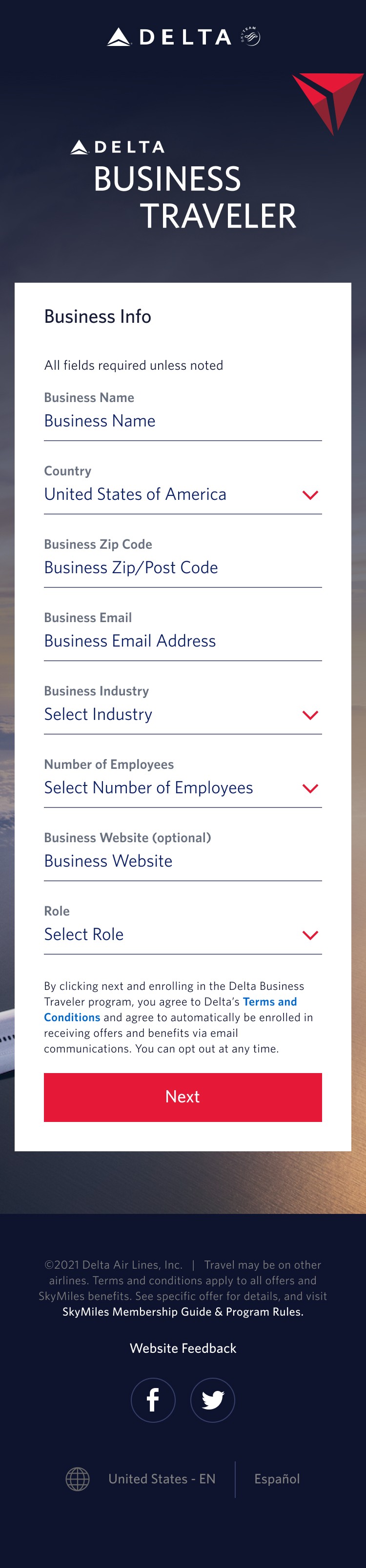
The modal design consisted of a 2 step process for the user to adjust the name associated with their account.
In step 1 Users have the option to use their current Skymiles name, Secure Flight Passenger Name, or to enter their correct name
If neither the SkyMiles name nor Secure Flight Passenger Name is correct, the third option allows users to input their first, middle, and last name, along with prefix and/or suffix.
In step 2 users receive feedback to verify the accuracy of the name entered regardless of the option chosen.


2.3 Error Prevention with Disabled State
Users can self-edit their names only once. Therefore, presenting users with disabled states when they receive the modal offers significant advantages to prevent mistakes.
The disabled states serve the following purposes:
Preventing users from selecting an incorrect name, which could result in errors.
Providing feedback to users that they need to make a choice in step 1 and proceed to step 2.
Ensuring that users cannot submit without choosing their identity.
Allowing users to exit the modal freely by clicking on the "x" icon or outside the modal.
2.4 Transforming Name Change Modal to Mobile Design
To integrate the modal into a mobile platform, we had to make some design changes while keeping the desktop version identical in a mobile-friendly way.
The following decisions were made:
Shifted from a 2-step column design to a vertical 2-step design to fit the content on the mobile screen.
Retained the font, colors, and items to ensure consistency and accuracy between devices.

2.5 Adapting Modal for Delta Design Systems
Incorporating the same design system used in Delta.com, the modal includes various elements such as fonts, colors, form fields, dropdown menus, checkboxes, CTA buttons, and sizing.
This system ensures consistency and coherence across all Delta.com products, resulting in a polished and cohesive user experience.
Development
3.1 Developer Handoff
Once my design proved to be successful, I began to annotate the notes needed for the developers. The team made sure that all the behaviors in the design were described as how they should react on the website. Sizes for text and spacing were also added to the designs so that developers have an accurate reference of sizes.
3.2 Placement of Modal and Behavior
The most effective way to provide users with this tool was by presenting it in the form of a modal when they landed on the SkyMiles page.
The following decisions were made:
The modal would only be displayed to users whose SkyMiles name and primary passenger name did not match.
The modal would clearly explain to the user the reason for the mismatch and provide a 2-step process to fix it.
To prevent users from submitting an incorrect name, the modal would initially appear in a disabled state.

Reflection
4.1 Reflecting on the Project
This project provided me with valuable insights into the design systems, requirements, and behavior of various design elements throughout the website. It was a great opportunity for me to collaborate closely with developers, project owners, and quality assurance co-workers, which helped me establish strong working relationships with them.
4.2 Looking Ahead
In the future, as I develop new relationships and gain knowledge, I will be able to enhance my problem-solving abilities and design skills for the airline industry. This, in turn, will increase my efficiency in working with Delta.com products, allowing me to create and refine future designs for other projects, as well as provide support to developers when needed.